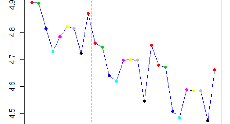
QOP and QOPA can help reframe the discussion about pitch quality.
QOP is a model that combines speed, location and movement (rise, total break, vertical break and horizontal break) into a single number that calculates the quality of a pitch on a scale from 0 to 10. See our website, QOP Baseball, for more information including how it was developed and access to the data. QOP has numerous possible applications, including pitcher improvement (comparing pitches during and between seasons, see section 5), scouting (if implemented on a radar gun in minor leagues or overseas), injury prevention (significant decline during a season, see our SABR 2015 presentation, slides 25-28), and fan enjoyment (different info than mph or rpm).
I have calculated the QOP value (QOPV) for every pitch in the PITCHf/x database, going back to 2008. Using these data I will answer the primary questions posed by the analysts during our meetings at the SABR conference. I’ll lead off by showing the correlation between QOP and ERA (Section 1), followed by additional ways that QOP relates to results (sections 2-4), and conclude with some examples of what QOP can do (section 5).
1. How does QOP relate to ERA?
The leading question from analysts during our meetings was – How does QOP relate to ERA? Having looked at scatterplots of ERA for one year versus the next, for the same set of pitchers, I knew that the correlation was very low (r = 0.20 to 0.24). How could any statistic, let alone QOP, correlate with ERA? One of the analysts (they all asked that their names not be used) gave me a great tip: filter the data by low innings pitched, and combine across years to reduce noise. When I did that, I was very nervous because the relationship was not smooth, and varied among ERA, FIP and SIERA. Then the insight came: we knew the QOP average (QOPA) was sensitive to the following different game factors: pitch type, pitch count, runners on base, and times through the batting order (see section 2). So, I calculated the mean effect of these four factors, by year, and adjusted the individual QOPVs accordingly.
For example, for 2015 all QOPVs with pitch count 0-2 were adjusted by -1.11 while those with pitch count 3-2 added 0.26, and so on. Similar with pitch type, runners on base, and times through the batting order. Then I subtracted the mean QOP for the season to center the distribution of QOPVs for each season at zero. The average of these adjusted-QOPVs is the resultant “pitcher effect.” Here is the graph of pitcher effect vs. ERA:
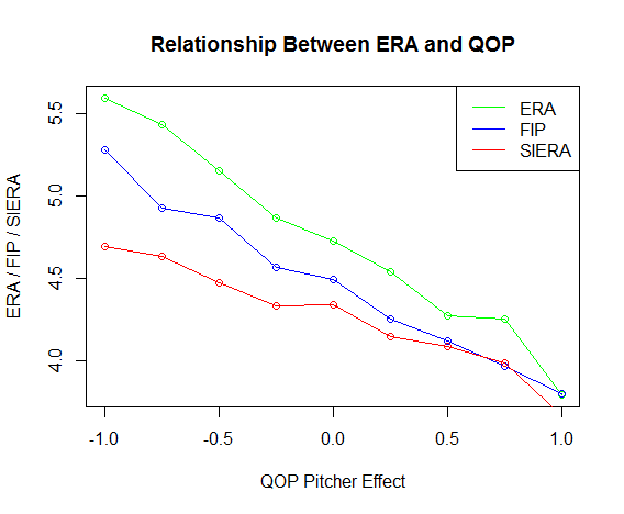
For added comparison, I did the same with FIP and SIERA. The points shown are from the starting pitchers from 2008-15 grouped into bins on the x-axis versus the average ERA for those same pitchers on the y-axis. It is revealed that as the pitcher effect goes up, ERA, FIP and SIERA go down. Other statistics could be used as well. Here is one for home runs per nine innings, HR/9.
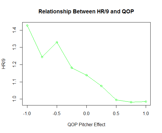
There is an interesting bump around -0.5. It can be seen in the FIP graph, above, although there it doesn’t break the trend. I don’t know the explanation at this time, but the same phenomenon has been observed for home runs with mph.
Thus, we have answered the analyst’s first question: As QOP goes up, ERA goes down.
2. What does QOP say about the different pitching factors?
Since in the previous section we removed the mean effect of runners on base, pitch count, pitch type and times through the batting order, I want to show some details. First, here are the QOPAs for runners on base:
| Runners | None | 1st | 2nd | 3rd | 1st&2nd | 1st&3rd | 2nd&3rd | 1st&2nd&3rd |
|---|---|---|---|---|---|---|---|---|
| QOPA | 4.66 | 4.62 | 4.53 | 4.48 | 4.6 | 4.54 | 4.46 | 4.59 |
The QOPA drops with men on base, with the lowest QOPA in the “pressure situations” of runners on third base and on second and third bases. Second, here are the QOPAs for each pitch count:
| Count | 0-0 | 0-1 | 0-2 | 1-0 | 1-1 | 1-2 | 2-0 | 2-1 | 2-2 | 3-0 | 3-1 | 3-2 |
|---|---|---|---|---|---|---|---|---|---|---|---|---|
| QOPA | 4.80 | 4.56 | 3.50 | 4.87 | 4.73 | 4.08 | 4.93 | 4.89 | 4.55 | 4.89 | 4.97 | 4.86 |
Pitchers tend to throw out of the strike zone with the 0-2 count and with more precision in a fuller count. The QOPAs quantify this knowledge.
Third, here are the QOPAs for the top 10 pitch types.
| Type | CH | CU | FC | FF | FS | FT | KC | KN | SI | SL |
|---|---|---|---|---|---|---|---|---|---|---|
| QOPA | 4.27 | 4.56 | 4.49 | 4.70 | 4.21 | 5.05 | 4.48 | 4.23 | 5.05 | 4.21 |
Because of the way QOP is calculated, some pitches have higher QOPA than others (e.g. FT and SI are pitch types with high velocity, good command and great movement). On the one hand, this allows pitches of different types to be measured by the same absolute yardstick. On the other hand, by removing the effect, as we have done with the above ERA result, this allows all pitches to be compared on a relative basis. Fourth, what about times through the batting order?

The primary observation is that QOPA goes down in both the second time and third time through the batting order. This phenomenon was discussed in Tango, Lichtman and Dolphin’s well-known The Book: Playing the Percentages in Baseball and is nicely described by Mitchel Lichtman in this 2013 article at Baseball Prospectus.
QOP provides additional insight: The same basic pattern is shown to hold for the nine batters each time. The first and ninth batters face the highest QOPA, with the fourth, fifth and eighth seeing the lowest. The calibre of QOPA is proportional to the presumed strength of the batter.
The QOPAs for all pitch types and counts in this section (except KC, KN and 3-0) have a margin of error of +/- 0.02 or less. This means that if two statistics are more than 2*0.02=0.04, or about 0.04 apart, then the pitching for those phenomena are measurably different.
3. How does QOP relate to other results?
Unfortunately, at the SABR conference I didn’t have the ERA results yet. So the analysts asked me whether QOPA relates to any other results. I explained the difficulty of relating QOP to ERA and other conventional statistics because they are mostly only one number, per pitcher, per season. With individual QOP values (QOPV), there is one number per pitch, which for most starting pitchers is over 2,000. Using this rich dataset, I looked for ways to exploit the variation. This section contains what I did show many analysts that day.
One way to measure the result of a pitch is the number of bases run on a single hit (one, two, three or four). Again grouping QOPV into bins, this graph shows that the proportion of home runs for high QOPV pitches is low, and increases as QOPV decreases. The reverse holds for singles.
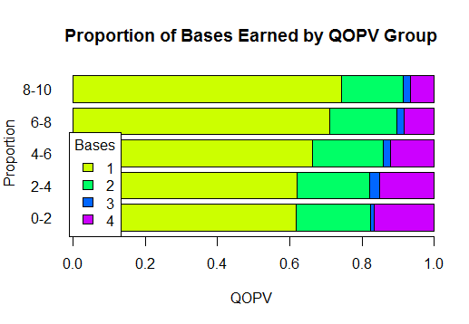
The data in the graph from the 2015 season and the proportion (counts) can be found in the table below. The results for other seasons are similar.
| QOPV Groups | 1 Base | 2 Bases | 3 Bases | 4 Bases | Sum |
|---|---|---|---|---|---|
| 8-10 | 0.744 (428) | 0.170 (98) | 0.019 (11) | 0.066 (38) | 1.00 (575) |
| 6-8 | 0.711 (6,412) | 0.185 (1,671) | 0.019 (174) | 0.084 (757) | 1.00 (9,014) |
| 4-6 | 0.662 (7,251) | 0.196 (2,143) | 0.022 (241) | 0.120 (1,312) | 1.00 (10,947) |
| 2-4 | 0.621 (3,222) | 0.201 (1,042) | 0.027 (141) | 0.151 (782) | 1.00 (5,187) |
| 0-2 | 0.618 (178) | 0.205 (59) | 0.010 (3) | 0.167 (48) | 1.00 (288) |
For example, the lower left entry of 0.618 represents 178 singles from pitches with 0-2 QOPV out of a total of 288 0-2 QOPV pitches, 0.618=178/288. The next graph shows the distribution of QOPV by the number of bases run on a swing that resulted in a hit.

The QOPVs for home runs is again clearly lower than the QOPVs for singles. The next graph shows QOPV by pitching designation.

This graph also shows that higher QOPV associates with better results. For specifics, see the table below.
| Event | 0-2 | 2-4 | 4-6 | 6-8 | 8-10 | Total |
|---|---|---|---|---|---|---|
| Called Strikes | 372 | 9,510 | 28,476 | 33,570 | 2,750 | 74,678 |
| 0.005 | 0.127 | 0.381 | 0.45 | 0.037 | 1 | |
| In Play, Out(s) | 564 | 9,946 | 23,128 | 18,837 | 1,290 | 53,765 |
| 0.01 | 0.185 | 0.43 | 0.35 | 0.024 | 1 | |
| In Play, Run/No Out | 312 | 5,657 | 11,969 | 9,971 | 635 | 28,544 |
| 0.011 | 0.198 | 0.419 | 0.349 | 0.022 | 1 | |
| Fouls | 1,147 | 15,162 | 35,638 | 25,917 | 1,488 | 79,352 |
| 0.014 | 0.191 | 0.449 | 0.327 | 0.019 | 1 | |
| Missed Bunt | 11 | 53 | 150 | 119 | 7 | 340 |
| 0.032 | 0.156 | 0.441 | 0.35 | 0.021 | 1 | |
| Swinging Strikes | 1,404 | 7,820 | 17,776 | 11,561 | 464 | 39,025 |
| 0.036 | 0.2 | 0.456 | 0.296 | 0.012 | 1 | |
| Out of Zone Pitches | 23,171 | 38,477 | 49,611 | 24,329 | 1,156 | 136,744 |
| 0.169 | 0.281 | 0.263 | 0.178 | 0.008 | 1 | |
| Total | 26,981 | 86,625 | 166,748 | 124,304 | 7,790 | 412,448 |
| 0.065 | 0.21 | 0.404 | 0.301 | 0.019 | 1 |
The highest proportion of Called Strikes occurs in the 8-10 QOPV group and the lowest in the 0-2 QOPV group. For In Play, Out(s), 37 percent (purple + blue) came from 6-10 QOPV whereas only 20 percent (red + yellow) came from 0-4 QOPV. The same kind of observation holds for every category except Out of Zone Pitches, where the expected reverse trend obtains, with 17 percent from 0-2 QOPV and 1 percent from 8-10 QOPV. Every category of association is what I expected except In play/run, no outs, where I expected the higher proportion to be with the low QOPV pitches.
What happened? It turns out that the lowest QOP pitches are much less likely to be swung at. For example, it turns out that 23,171/26,981 = 85.9 percent of 0-2 QOPV pitches are out of the strike zone, whereas only 1,156/7,790 = 14.8 percent of 8-10 QOPV pitches are out of the zone.
In summary, I was able to show the analysts how QOPV is associated with the proportion of bases by group, the number of bases, and pitch designation.
4. Cross-Validation
After seeing the strength of the evidence that day, a group of analysts from one team took a different angle. They wanted to know if our model was statistically consistent with itself. I took my laptop to the next few sessions and worked out the code to perform a twofold cross-validation of QOP. Using the 2015 regular plus postseason data, I did the following: For each pitcher, I randomly divided his QOPVs into two groups and took the mean of each group, mean1 and mean2. This was repeated for each pitcher, giving a total of 734 pairs of (mean1, mean2). Next I calculated the Pearson’s correlation between the two groups. This was repeated 10,000 times. The mean (standard deviation in parentheses) of the 10,000 correlations is shown below (SD in parentheses).
| Pitch Type | 1 | 30 | 100 | 200 |
|---|---|---|---|---|
| All Pitches | 0.722 (0.029) | 0.822 (0.016) | 0.883 (0.009) | 0.901 (0.007) |
| Fastballs | 0.747 (0.035) | 0.844 (0.013) | 0.900 (0.007) | 0.925 (0.006) |
| Off-Speed | 0.542 (0.038) | 0.684 (0.023) | 0.798 (0.014) | 0.843 (0.012) |
I did the same process with all pitches combined, fastballs only, and off-speed pitches only. While the results were adequate for all pitches combined (R2=52 percent) and fastballs (R2=56 percent), the off-speed pitch correlation was too low to consider the data validated (R2=29 percent). When I threw out the pitchers with minimums below 30, 100, and 200, all correlations rose to very good cross-validation levels. When I emailed it to the analysts the next day, they seemed satisfied.
What can QOP do?
I left the conference with the ERA question ringing in my mind, as well as some areas of our analysis which needed work. Nevertheless, through discussion after discussion of seeing how QOPA and the breakdown of the components explained the intuitive rankings of most of the analyst’s pitching rosters, I felt like it was ready to use. In this section, I would like to show how I used QOPA to answer some of the questions my colleague, Wayne Greiner, threw at me during the 2016 baseball season.
Below is a diverse set of five examples that show the utility of QOP while further reinforcing its consistency with known results. The first four take recent articles that discuss pitcher performance and offer a look from the perspective of QOP. The last one examines ERA projection. As we proceed, I would like to stress that the primary goal in this section is not to answer the questions posed, but rather it is to show the utility of QOP. While reading, it may be useful to note the margin of error of the QOPA of a starting pitcher for one season (2,000 to 3,000 pitches) is around 0.15.
5.1. Single Pitcher Over Multiple Seasons: Cole Hamels
In “Cole Hamels Got Better in the Big Leagues,” Eno Sarris describes how, at the age of 28, Cole Hamels increased his velocity, added a cutter, and added a curveball to his fastball and change-up. Sarris shows graphs of (1) Hamels’ fastball velocity increasing after 2012 but going down in 2016 and (2) Hamels’ cutter dropping from two home runs per nine innings in 2008 to 0.5 home runs in 2015, with a spike up past 1.5 home runs in 2016. QOPA adds insight to the story.
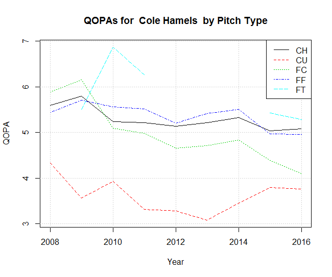
- For fastballs (FF, FT), the QOPA partly matches the shape of Sarris’ smoothed velocity curve. The rise in 2012-2014 is notable, as well as the decline after 2014. The spike in 2010 is matched with the two-seamers (FT), but not four-seamers (FF), which is an interesting distinction.
- For the cutter (FC), the spike in home runs since 2015 is matched by a dip in QOPA.
- For the curveball (CU), the QOPA goes up after 2013, matching the Sarris’ remark about increased speed.
- For the change-up (CH), there is consistent decline over Hamels’ career. That said, his lowest change-up QOPA is 5.03 in 2015, which was at the 90th percentile for the league that year. The league-wide change-up QOPA was 4.31.
There was discussion, without graphs, in Sarris’ article for the curveball and change-up. The QOPA graph again offers further insight…
5.2. Single Pitcher Within a Single Season: Steven Matz
In the article “Matz’s Elbow Already Causing Changes to His Game,” Mike Petriello discussed Steven Matz’ efforts to continue pitching in 2016 despite a bone spur. Petriello’s section headings were, “velocity hasn’t changed,” “too much spin?,” “less extension,” and “no more sliders.” While some velocity and RPM stats were mentioned, there were no graphs or extensive stats. If we take the QOPA of each successive at bat of Matz and plot them in order, we get:
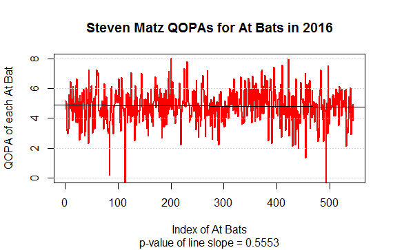
There was no significant decline in Matz’ QOPA in 2016.
5.3. All Pitchers Over Multiple Seasons: The Scoring Surge in 2015 and HR Increase from June to August
In “A Baseball Mystery: The Home Run is Back and No One Knows Why,” Arthur and Lindbergh investigated “an unusual scoring surge in 2015.” Their theories were: (i) warmer weather, (ii) better rookie hitters, and (iii) bouncier baseballs. When they asked around, the main clubhouse theories were (i) and (ii), with the addition of (iv) decline in pitching quality. After searching, Arthur and Lindbergh found that (i) and (ii) could have resulted in very slight increases, but not enough to explain the jump. They completely ruled out (iii). They did not explore (iv), which is the domain of QOP, so here it is….
First, this graph shows the average number of runs per nine innings from 2008 to 2015 plotted against QOPA. (Conveniently, the same numeric scale is applicable to both statistics on the y-axis.) The Run Average/nine data are the annual values from the trend line in Arthur and Lindbergh’s paper. One observation is that, although they correctly note a RA/9 surge in late 2015, the overall trend is still down. Please see their excellent graph, compared to the one below, to appreciate the difference in perspective.

The Spearman correlation between QOPA and RA/9 is -0.82, indicating a strong negative correlation (Pearson’s correlation = -0.84). Statistically speaking, for annual averages, it is normal for random fluctuations to occur in individual values (Arthur and Lindbergh’s graph), while overall trends hold (my graph). Thus, it is possible for there to be both a “scoring surge” and a declining trend in the data. In fact, a “scoring surge,” or pattern of a substantial increase in monthly runs observed indicated by a long positively sloped line segment, can be observed in half of the 16 years shown in Arthur and Lindbergh’s graph.
Alan Nathan, the well known baseball physicist, observes a different kind of “scoring surge” in 2015. After being consulted by Arthur and Lindbergh for their article, he wrote about an increase in home runs from July to August. In particular, he asked, “How does it happen that a small increase in exit speed can lead to a relatively large increase in home run production?” Using Statcast exit velocity data, he looked at the exit velocity of hits in June vs. August 2015 and concluded that an “increase in home runs per batted ball after the All-Star Game… was accompanied, and perhaps caused, by a small ~1 mph increase in the mean exit speed.”
He drew this conclusion by taking the Statcast exit velocity data and comparing June vs. August, along with the home run probability distribution for different exit velocities. It is in the exit velocity range of 95 to 105 mph that small changes result in substantial changes in home run probability (about 1.5 percent per MPH). Accumulating the increased probabilities for all pitches, Nathan estimates a 13 percent increase in all home runs, which is very close to the amount observed.
Looking at this over time, like Arthur and Lindbergh, is there an annual pattern to the July-August home run surge? It turns out that in seven of the last eight years, the number of home runs goes up from July to August. Furthermore, the QOPA goes up from July to August in the same years, which is the opposite of what I’d expect:
| Year | HR Diff | QOPA Diff | MPH Diff |
|---|---|---|---|
| 2008 | 28 | 0.09 | 0.55 |
| 2009 | 105 | 0.07 | 0.52 |
| 2010 | 75 | 0.06 | 0.53 |
| 2011 | 199 | 0.01 | 0.00 |
| 2012 | 13 | 0.11 | 0.05 |
| 2013 | -12 | -0.01 | 0.32 |
| 2014 | 9 | 0.01 | 0.22 |
| 2015 | 144 | 0.14 | 0.61 |
The columns are August minus July values. The Spearman’s correlation between the increase in home runs vs. QOPA is 0.35 (0.16 Pearson’s) whereas between homers vs. and mph is 0.14 (0.00 Pearson’s). Observations:
- There appears to be a pattern of a home run increase from July to August (after the All-Star break). (Why?)
- Although there is a mean increase in mph, it is not correlated with homers. (Why?)
- There is a slight positive correlation between homers and QOPA. (Why?)
A substantial part of the increase in QOPA seems to be increased speed (Spearman’s correlation = 0.50; Pearson’s = 0.46). There are other factors as well, though. Although further questions are raised, QOP is able to rule out Arthur and Lindbergh’s clubhouse theory (iv), decline in pitching quality. Indeed, pitching quality increased in 2015 and has a pattern of annual increases from July to August.
Could the increased pitch speed be transferring to increased exit velocity? It is 0.61 mph in 2015, which would translate into only around 0.12 mph of exit velocity (20 percent of 0.61), according to a Diamond Kinetics discussion with Alan Nathan. If the full explanation isn’t the equipment or the weather or the rookie batters or decreased pitch quality, statistically speaking it is probably some of each, plus an unknown factor. My main point is to show QOP helped answer the question by ruling out an explanation. My personal guess for the missing factor is batter experience: Perhaps they are studying the pitchers and gaining an advantage later in the season?
5.4. Defending Against Pitchers: Batters
The preceding examples have all been about the pitchers and their QOPA. We believe that the result of every step of baseball rests on the foundation of the quality of the pitch. Therefore, once pitch quantification is sufficiently developed, it can be used as a basis for batter quantification. This is an area of future research, but here is a graph we sent to a reporter who requested QOP information for whether the Toronto Blue Jays’ drop from 891 runs in 2015 to 759 in 2016 could have been due to a difference in the quality of pitching they faced. Each graph has one dot per team, by year. The x-axis is the QOPA of all opponents’ pitches that year. The y-axis is the runs scored that year by the team.
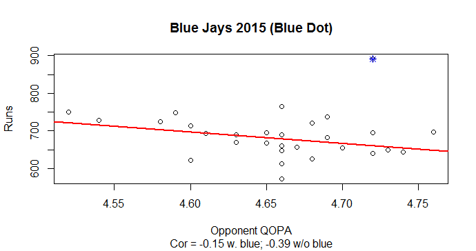

I see a weak trend where the higher QOPA correlates with fewer runs, in both 2015 and 2016. This is seen, however, only in the main group of the data. There are exceptions. The interesting thing is that the Blue Jays are the only exception in both years. In 2015 they clearly break the trend by scoring the highest number of runs in the majors (blue dot). In 2016 they have above average runs, but they, along with the Pirates and Mariners, faced the toughest pitching (according to QOPA). The Red Sox have the highest runs in 2016.
5.5. Predict ERA Increase/Decrease with 88 Percent Accuracy
While compiling pitcher reports with QOPAs, my colleague, Wayne Greiner, noticed that players with high ERA and QOPA tended to have their ERAs drop significantly the following year. To verify whether this was the case, I compiled the table below. Due to data merging issues, I was able to include only about two-thirds of the pitchers per year, but they are random and therefore representative.
| 08-09 | 09-10 | 10-11 | 11-12 | 12-13 | Overall | ||||||||
|---|---|---|---|---|---|---|---|---|---|---|---|---|---|
| QOPA | ERA | n | p | n | p | n | p | n | p | n | p | n | p |
| 4 | 4.5 | 164 | 0.713 | 156 | 0.737 | 124 | 0.766 | 108 | 0.796 | 122 | 0.811 | 674 | 0.759 |
| 4.5 | 4.5 | 102 | 0.706 | 87 | 0.782 | 68 | 0.809 | 60 | 0.817 | 84 | 0.821 | 401 | 0.781 |
| 5 | 4.5 | 20 | 0.85 | 16 | 0.75 | 13 | 0.846 | 12 | 0.75 | 24 | 0.875 | 85 | 0.824 |
| 5.5 | 4.5 | 2 | 1 | 0 | NA | 0 | NA | 1 | 1 | 3 | 0.667 | 6 | 0.834 |
| 4 | 5 | 118 | 0.788 | 115 | 0.765 | 81 | 0.753 | 78 | 0.833 | 92 | 0.837 | 484 | 0.793 |
| 4.5 | 5 | 74 | 0.73 | 61 | 0.787 | 46 | 0.804 | 45 | 0.822 | 60 | 0.867 | 286 | 0.797 |
| 5 | 5 | 14 | 0.786 | 7 | 0.714 | 10 | 1 | 9 | 0.778 | 15 | 0.933 | 55 | 0.855 |
| 5.5 | 5 | 0 | NA | 0 | NA | 0 | NA | 1 | 1 | 2 | 1 | 3 | 1 |
Reading from left to right, n is the number of pitchers who meet the QOPA and ERA criteria; p is the proportion of the n pitchers whose ERA was lower the following year. For example, the first row of the table reads as follows: For the 2008 major league season, there were 164 pitchers with an ERA of 4.5 or higher who also had a QOPA of four or higher. Of these 164 pitchers, 71.3 percent had their ERAs go down in 2009. The 09-10 columns read similarly, with the 2009 season data predicting the 2010 results, and so on.
For the ERA data, the table shows that, averaged over all seasons, for players with an ERA of five or higher in one season, if they also have a QOPA over five, the prediction accuracy is 85.5 percent (bold number in far right column). Using different combinations of QOPA and ERA thresholds, the prediction accuracy varies from 75.9 percent to 100 percent. The higher the QOPA, the higher the accuracy, although the fewer the players which meet this criteria. The margin of error for such predictions is from three to 10 percent, depending on the number of pitchers.
To evaluate the 85.5 percent prediction rate, we need to know the baseline rate, shown in the next table. The first entry, 0.555, means that 55.5 percent of the ERAs of all pitchers in the dataset from 2008 dropped in the 2009 season. The overall drop rate from 2008-13 is 53.0 percent, which is a little better than 50-50, perhaps due to low ERA pitchers retiring and high ERA rookies entering. Thus, using QOPA to predict ERA substantially increases the success rate. With that said, I acknowledge one reviewer who pointed out that regression to the mean would expect over 50 percent of players with above average ERA to drop.
| Stat | 08-09 | 09-10 | 10-11 | 11-12 | 12-13 | Overall |
|---|---|---|---|---|---|---|
| ERA | 0.555 | 0.501 | 0.495 | 0.581 | 0.513 | 0.530 |
As a result of these calculations, we projected the following nine players to lower their ERA in 2016.
| Pitcher | 2015 QOPA | 2015 ERA | 2016 QOPA | 2016 ERA |
|---|---|---|---|---|
| Enny Romero | 5.50 | 5.10 | 5.19 | 5.91 |
| Ivan Nova | 5.39 | 5.07 | 5.27 | 4.17 |
| Ross Detwiler | 5.33 | 7.25 | 5.14 | 6.10 |
| Bruce Rondon | 5.28 | 5.81 | 4.72 | 2.97 |
| Brad Hand | 5.26 | 5.30 | 4.91 | 2.92 |
| Matt Garza | 5.25 | 5.63 | 5.01 | 4.51 |
| Aaron Brooks | 5.14 | 6.67 | NA | NA |
| Christian Friedrich | 5.12 | 5.25 | 4.98 | 4.80 |
| Esmil Rogers | 5.11 | 6.27 | NA | NA |
Aaron Brooks and Esmil Rogers did not pitch that season, leaving seven players, with six of these pitchers posting a lower ERA in 2016. That is 85.7 percent, which is strikingly consistent with the historical accuracy of 85.5 percent, shown above. Using the same method, we forecast the following 16 players to post an ERA decrease in 2017:
| Pitcher | 2016 QOPA | 2016 ERA | 2016 NP | 2016 Team |
|---|---|---|---|---|
| Cody Anderson | 5.58 | 6.68 | 979 | CLE |
| Kyle Gibson | 5.51 | 5.07 | 2,452 | MIN |
| Michael Wacha | 5.32 | 5.09 | 2,302 | STL |
| Jesse Hahn | 5.31 | 6.02 | 711 | OAK |
| Chad Qualls | 5.28 | 5.23 | 528 | COL |
| Enrique Burgos | 5.22 | 5.66 | 714 | ARI |
| Enny Romero | 5.19 | 5.91 | 806 | TB |
| Ross Detwiler | 5.14 | 6.10 | 832 | OAK |
| Tom Wilhelmsen | 5.12 | 6.80 | 807 | SEA |
| Wade Miley | 5.10 | 5.37 | 2,728 | BAL |
| Andrew Cashner | 5.07 | 5.25 | 2,353 | TEX |
| Zach Eflin | 5.07 | 5.54 | 989 | PHI |
| Alfredo Simon | 5.06 | 9.36 | 1,109 | CIN |
| Elvis Araujo | 5.03 | 5.60 | 535 | PHI |
| Ubaldo Jimenez | 5.03 | 5.44 | 2,487 | BAL |
| Carlos Villanueva | 5.01 | 5.96 | 1,180 | SD |
In this section, although I made observations about pitchers and pitching on five diverse topics, my primary goal was not the specific observations! Rather, it was to show that QOP is well-suited for making such observations and brings valuable new insight to the conversation.
Wrapping Up
When I was leaving the conference, the analyst who gave me the insight for ERA waved at me and smiled. I waved back, thinking about how out of the 15 team representatives we talked to, he was the most critical – and therefore the most helpful. He worked for one of only two teams that did not agree with the ranking of their pitching roster by QOPA. The explanation from both teams was that their coaches used a different location model with at least some of their pitchers. We argued that QOP could still be used to measure the consistency of a single pitcher, but he didn’t care. He wasn’t asking for perfection (certainly QOP is not), but he wanted to see how QOP related to results. Others wanted to see if it was internally consistent. And yet others wanted to see what it could do. I offer this article as my first public attempt to answer those questions.
In closing, I would like to note that we have defined pitch quality as the physical, measurable, properties of a pitch that are under the pitcher’s control (movement, location and speed). It is NOT to be confused with pitcher quality, which includes subtleties like deception, tempo, sequence and context (handedness, outs, men-on-base, batter line-up). Some pitchers do not rely on quality, but on the subtleties for their success.
For example, Johnny Cueto had a 4.31 QOPA (2016), but varied his pitch tempo a lot. Masahiro Tanaka had a 4.26 QOPA (2016) but threw an even distribution of six pitch types in all circumstances. Madison Bumgarner, 4.29 QOPA (2016), was able to conceal his hold on the ball until release and thereby increase the deceptiveness of his pitch. These are all excellent pitchers – but their success is not measured so much by our yardstick of pitch quality (movement, location and speed), as other factors. Using QOP as a foundational component, we are currently exploring how to combine it with the other factors to determine pitcher quality.
I would like to thank all of the analysts who gave us time at the SABR conference, as well as those apart from SABR who have been willing to provide feedback over the last couple of years. I also thank my colleague, Wayne Greiner, for input into this research, without which this would not have been possible.
References & Resources
- QOP Baseball, 2015 SABR Analytics Conference Presentation
- QOP Baseball, “QOPA Margin of Error Table”
- Jeff Zimmerman, FanGraphs, “Batted-Ball Rates vs. Velocity Changes”
- Tom Tango, Mitchel Lichtman and Andrew Dolphin, The Book: Playing the Percentages in Baseball
- Mitchel Lichtman, Baseball Prospectus, “Baseball ProGUESTus: Everything You Always Wanted to Know About the Times Through the Order Penalty”
- Eno Sarris, FanGraphs, “Cole Hamels Got Better in the Big Leagues”
- Mike Petriello, MLB.com, “Matz’s elbow already causing changes to his game”
- Rob Arthur and Ben Lindbergh, FiveThirtyEight, “A Baseball Mystery: The Home Run Is Back, And No One Knows Why”
- Alan Nathan, The Physics of Baseball, “Exit Speed and Home Runs”
- Richard Lee, Diamond Kinetics, “Dispelling the Mystery of Pitch Speed”